

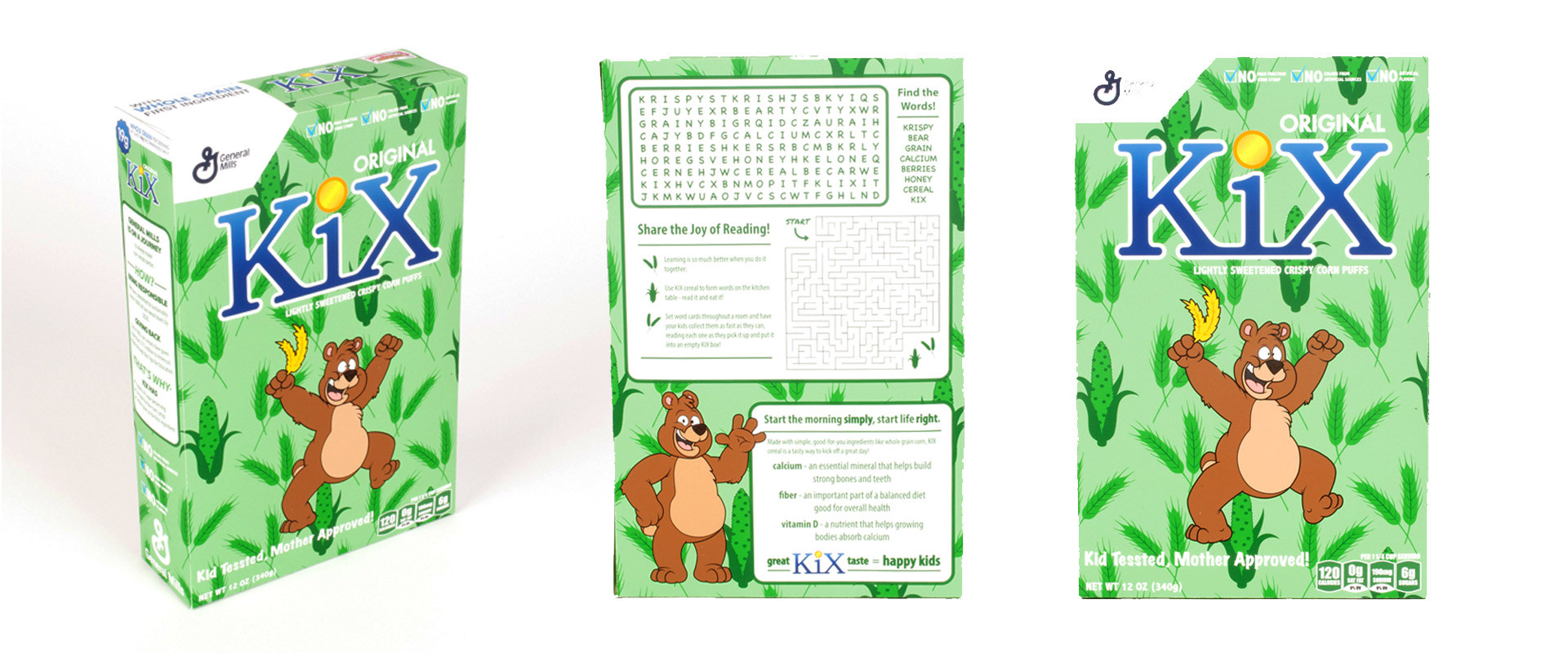
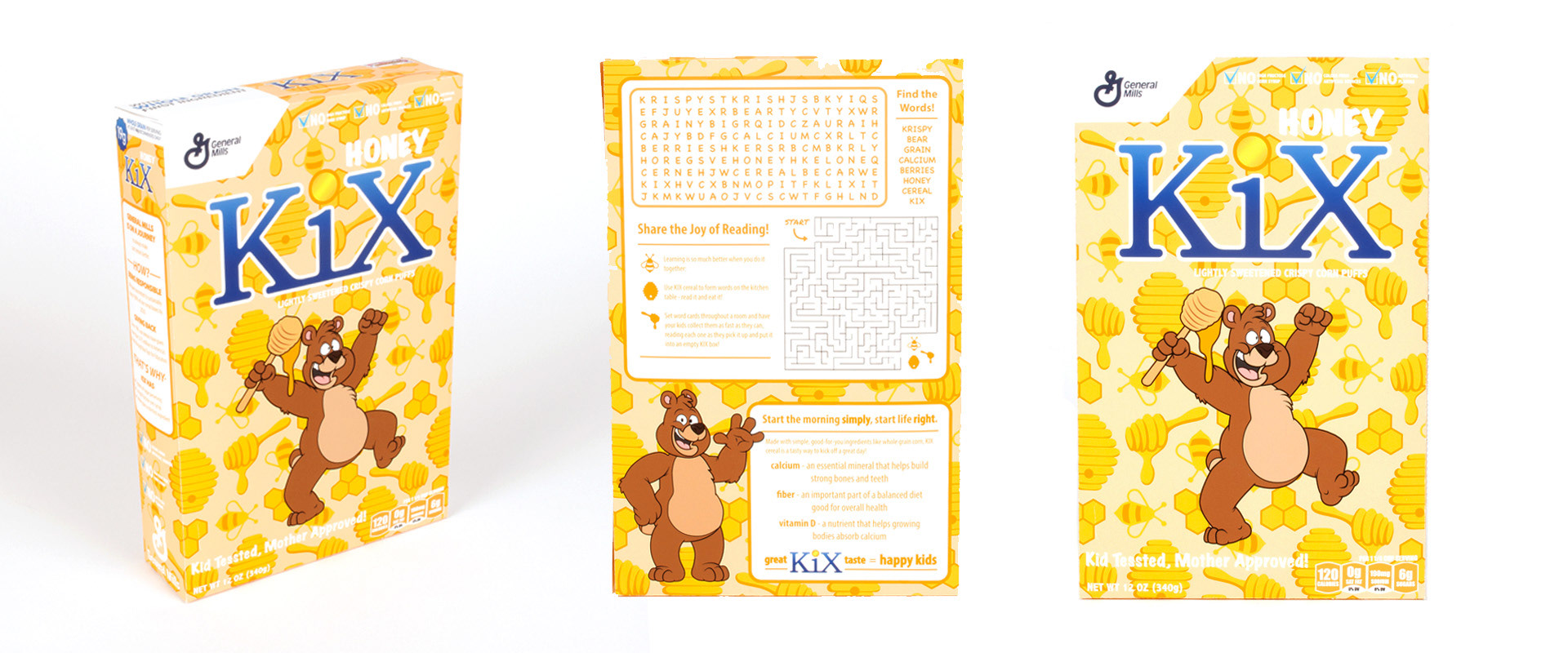
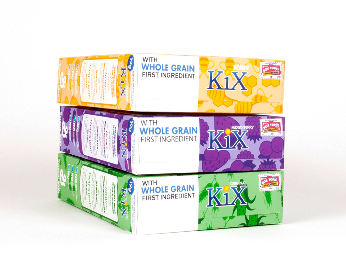
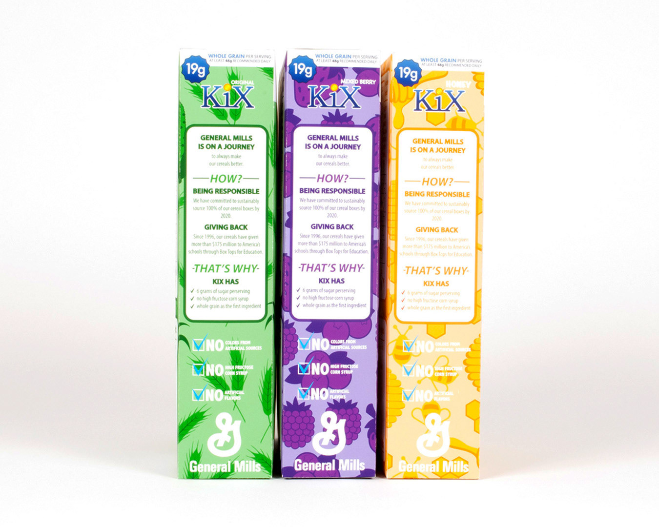
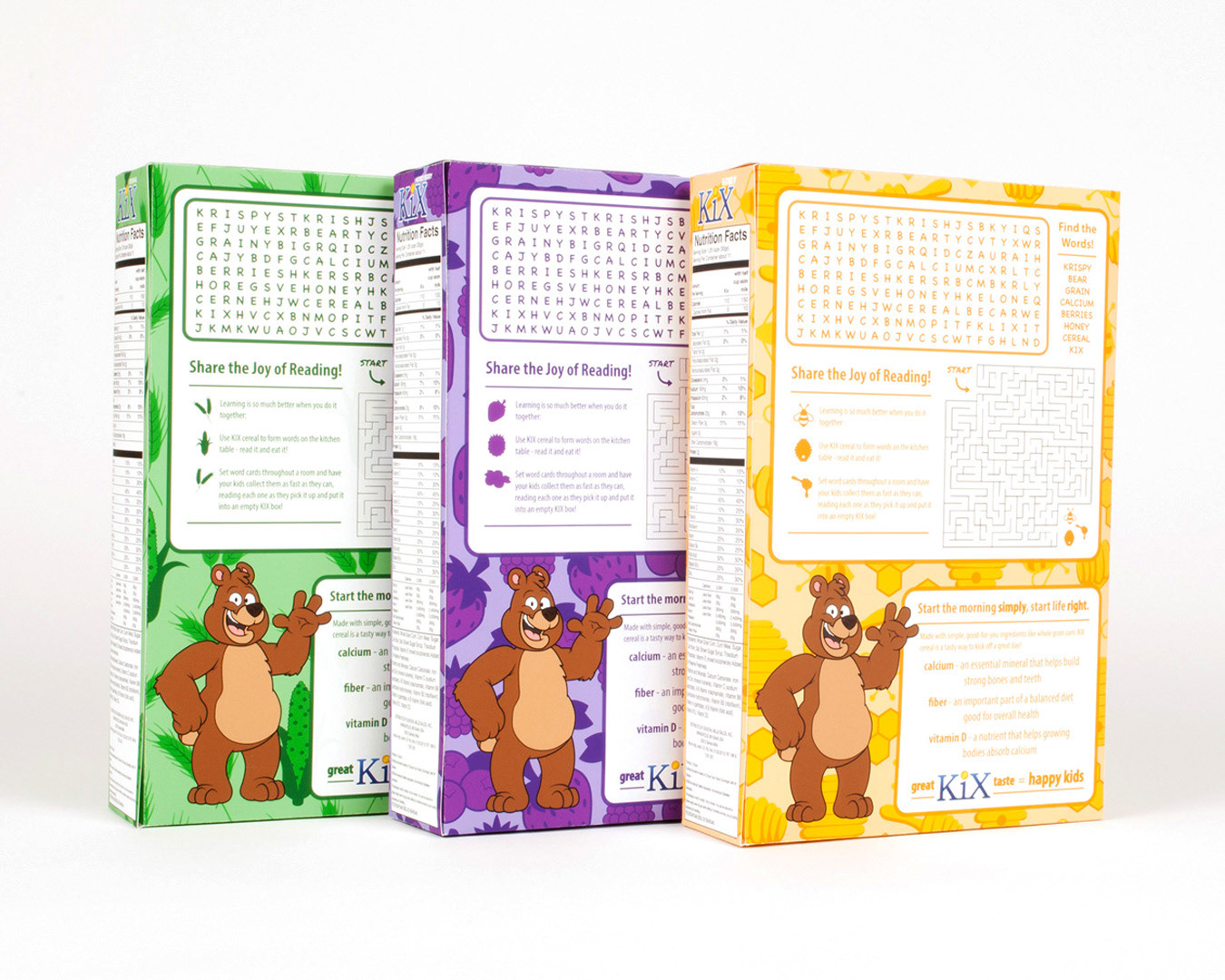
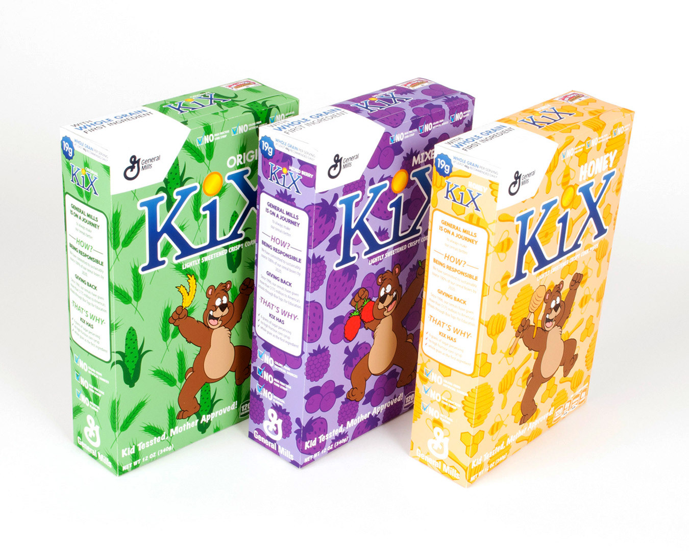
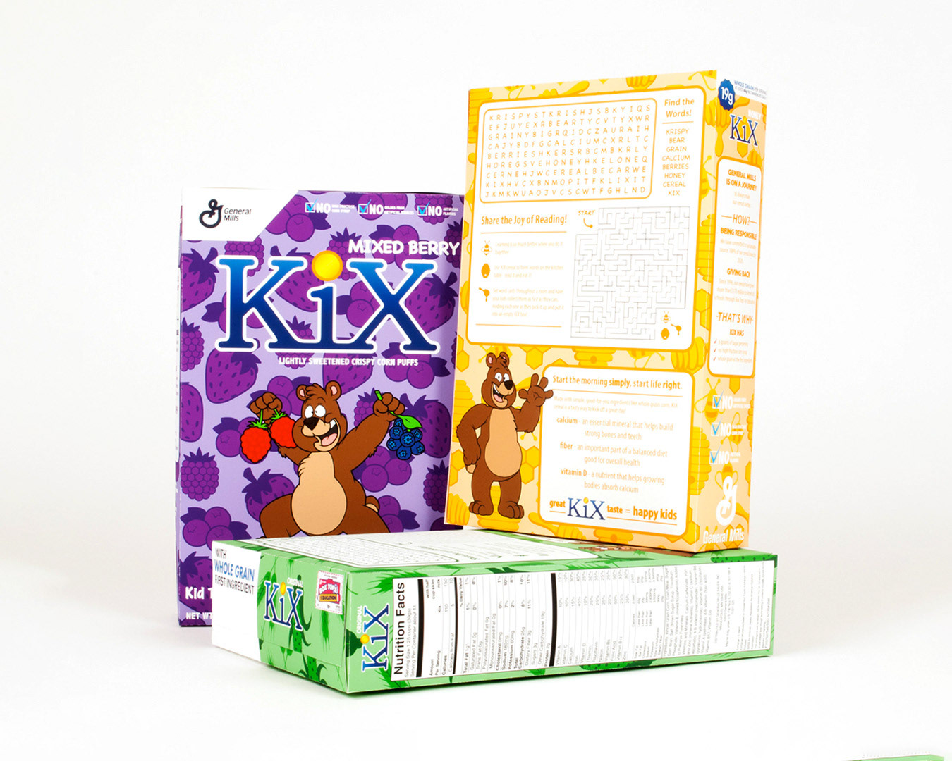
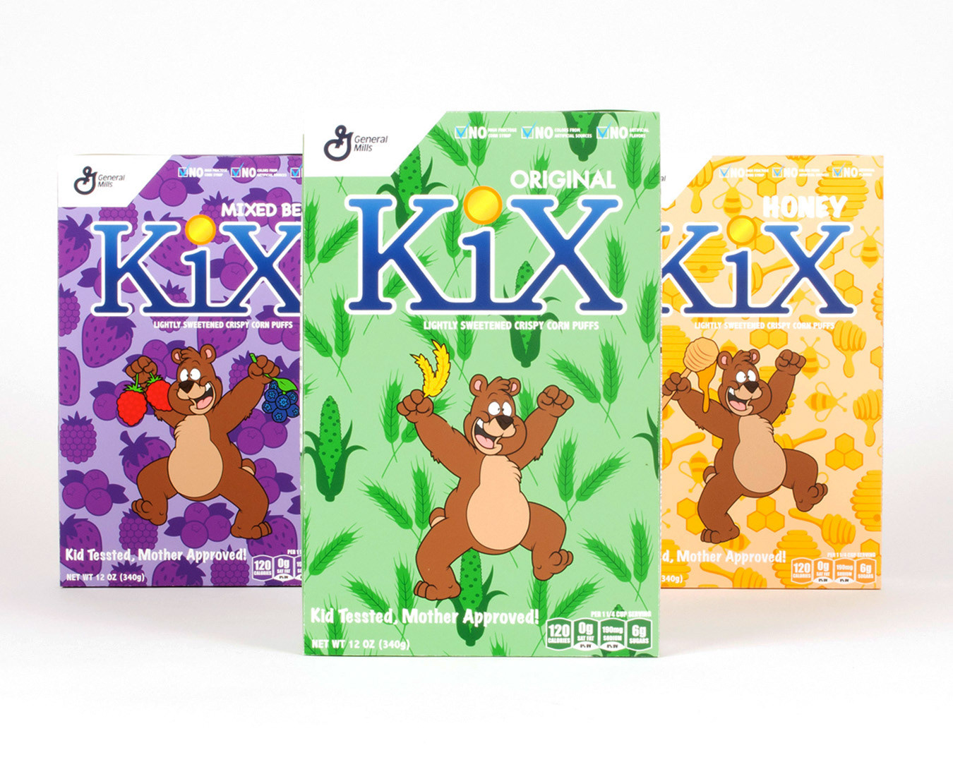
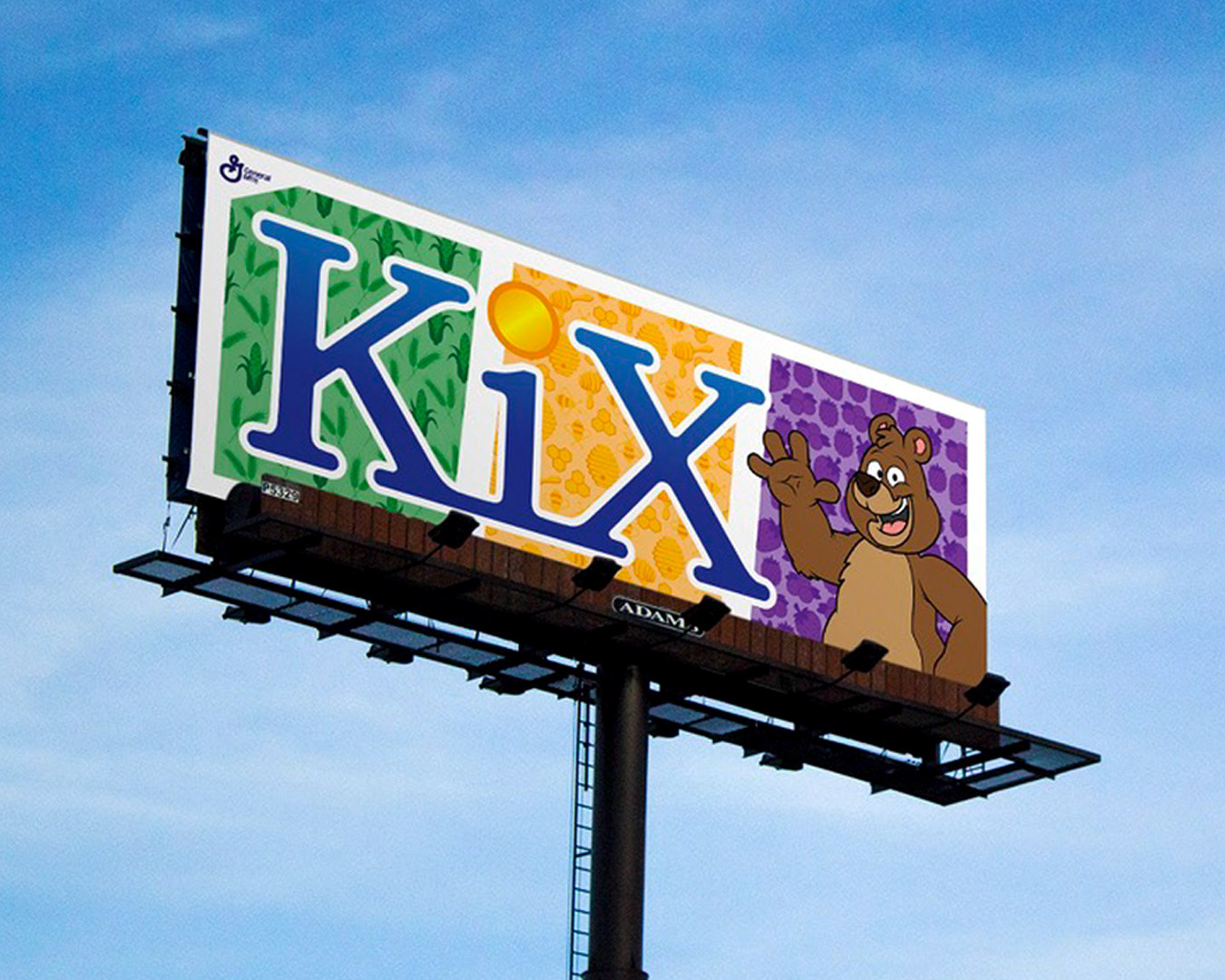
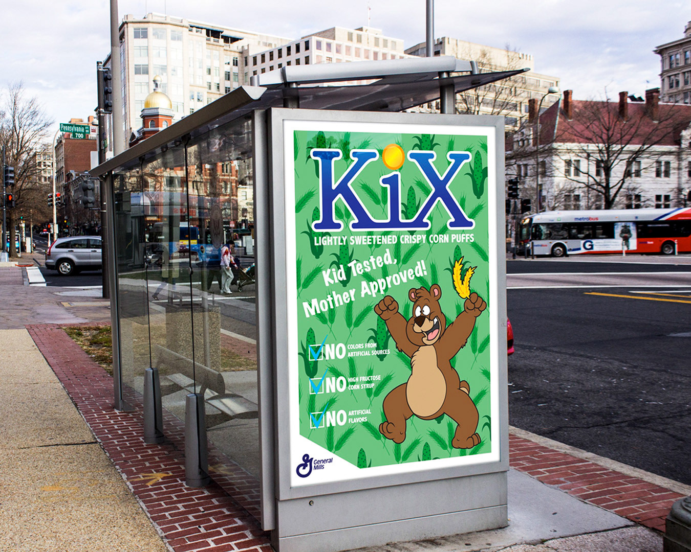
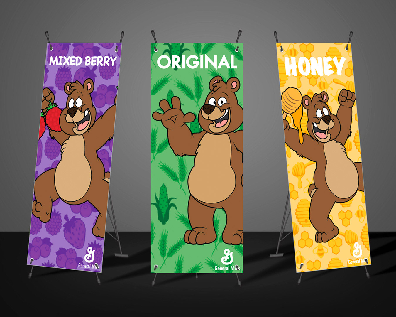
KIX Cereal
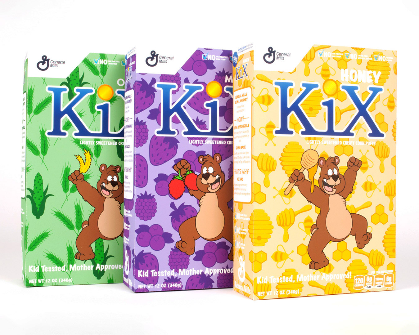
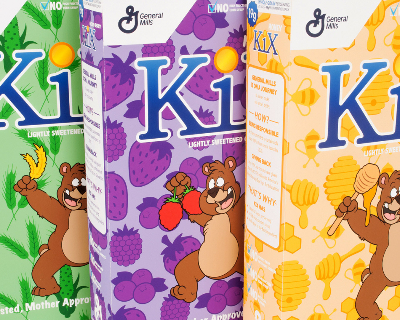
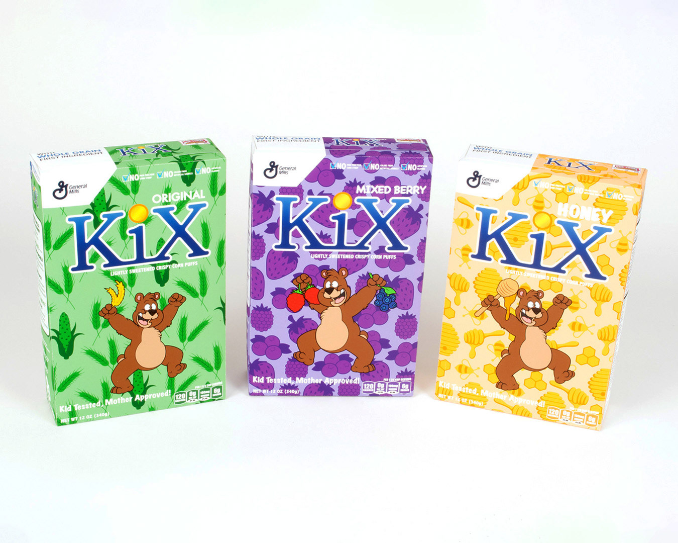
The Kix Cereal box has an outdated design. The perception of the company and their product do not fully communicate the unique background of the company and their products. Family values and a quality healthy product with first whole grain ingredients were the most important aspects to portray within the updated design. The overall appearance of the redesign also needs to stay true to their slogan, “kid tested, mother approved.”

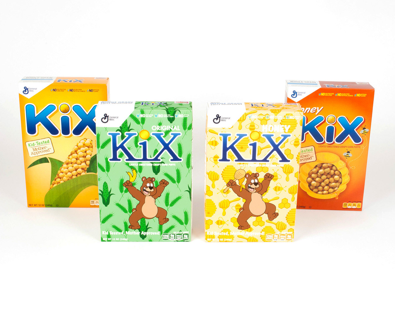
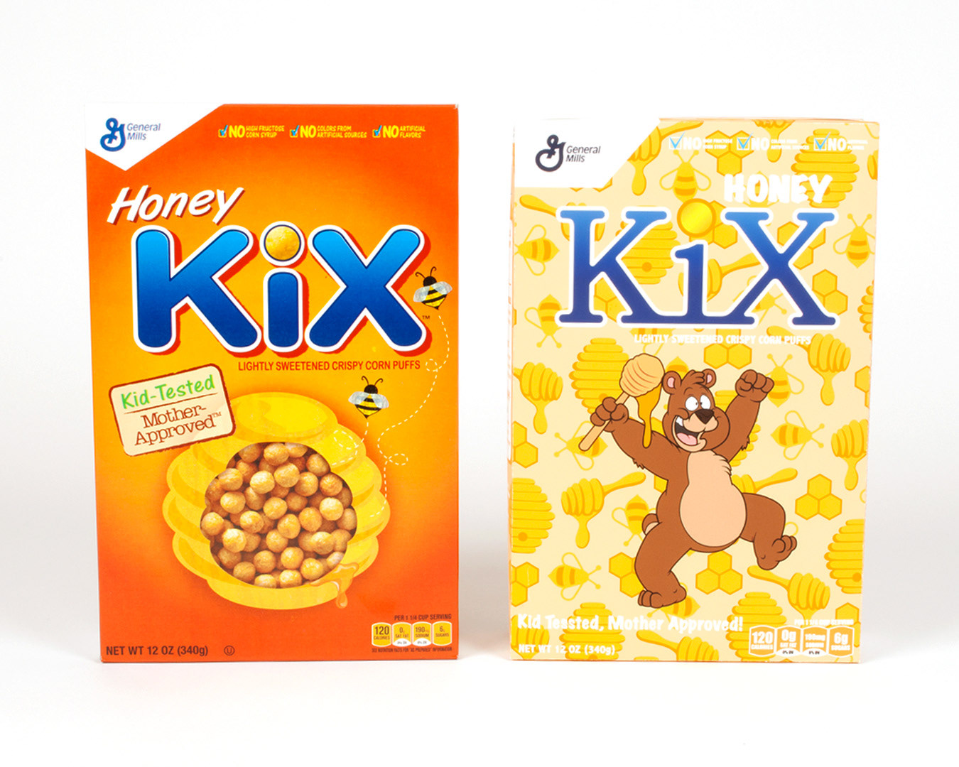
With a modern updated redesign to the KIX Cereal box, this will help push this companies quality product past their competitors. By updating the color pallet, rearranging the hierarchy layout of information on the box, and bringing more character to the every day cereal box is what will help push this companies product forward. Reaching out to a wider variety of customers and parents that want their children to be eating a quality, well balanced, healthy breakfast.


The Huber Family's Jam
Huber Family Foods is a privately owned company based in Loyal, Wisconsin, and was established in 1991. They are a single location business that operates right out of their own home. Only using simple ingredients that you could find within your own kitchen, the brand prides itself on their family ideals and its organic nature.
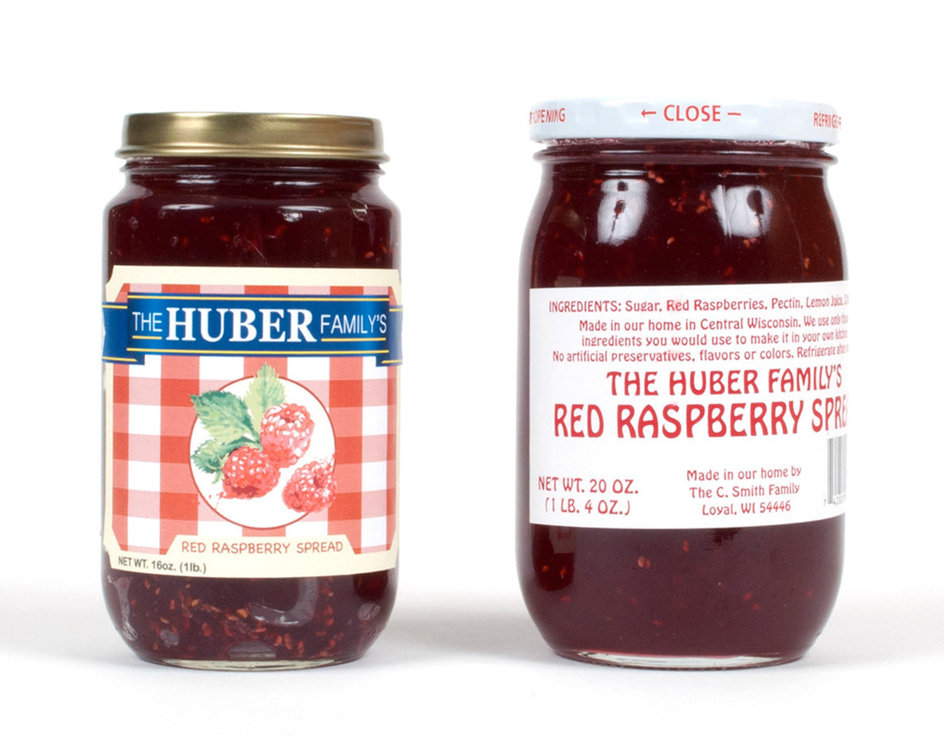
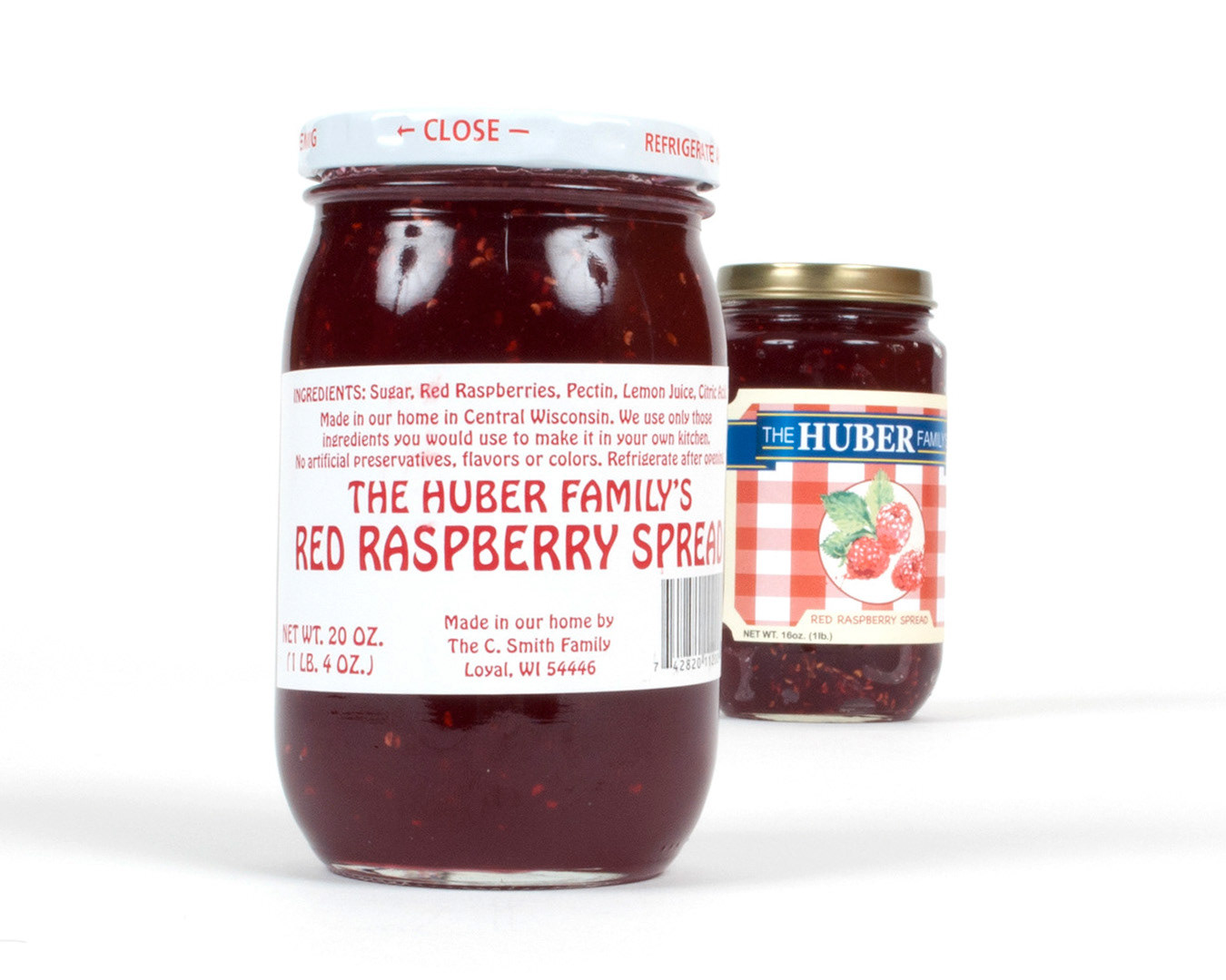
I thought that the original label and packaging was lacking some personality and information as well. The logo was bland and did not stand out from its competitors. There was also no nutrition facts labeled anywhere on the original packaging. The jam itself is very simple, organic, healthy, and traditional. It truly encompasses that authentic family feel, and also with a farmer's market quality.

Strategy Statement: The Huber Family's homemade jams are the pinnacle of quality and simplicity in the jam preservatives world. Unfortunately the packaging currently does not express the unique story of the company and their product. The simple well-crafted nature of the jam, along with its traditional attributes are the products most important aspects. The new design needs to bring the brand into the modern world with a clean design and a wider color scheme to help grab the consumer's attention.
These changes should help to reinforce the connection with the current middle aged consumers who appreciate a regionally produced high quality product, with all natural ingredients. The redesign also needs to attract not deter new younger consumers.

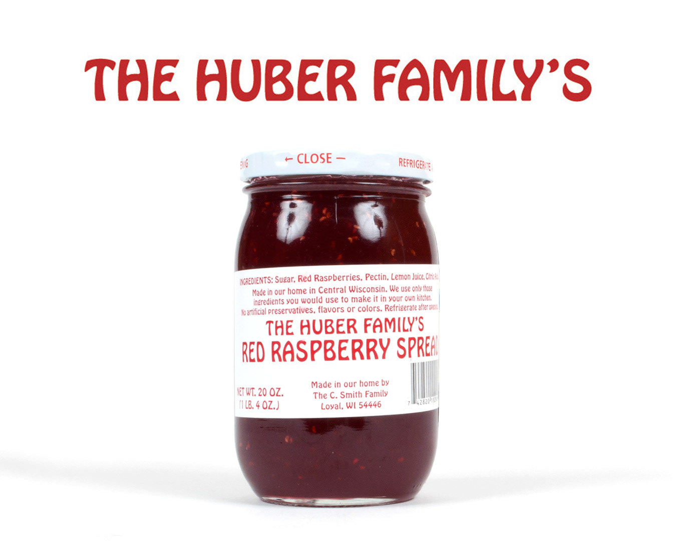

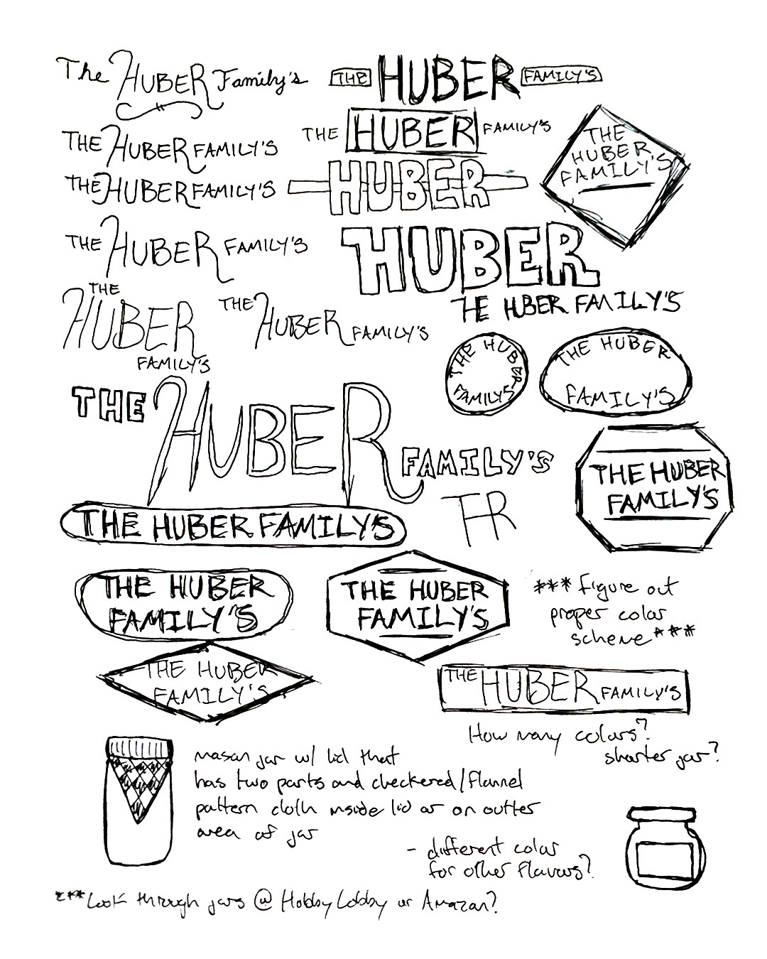
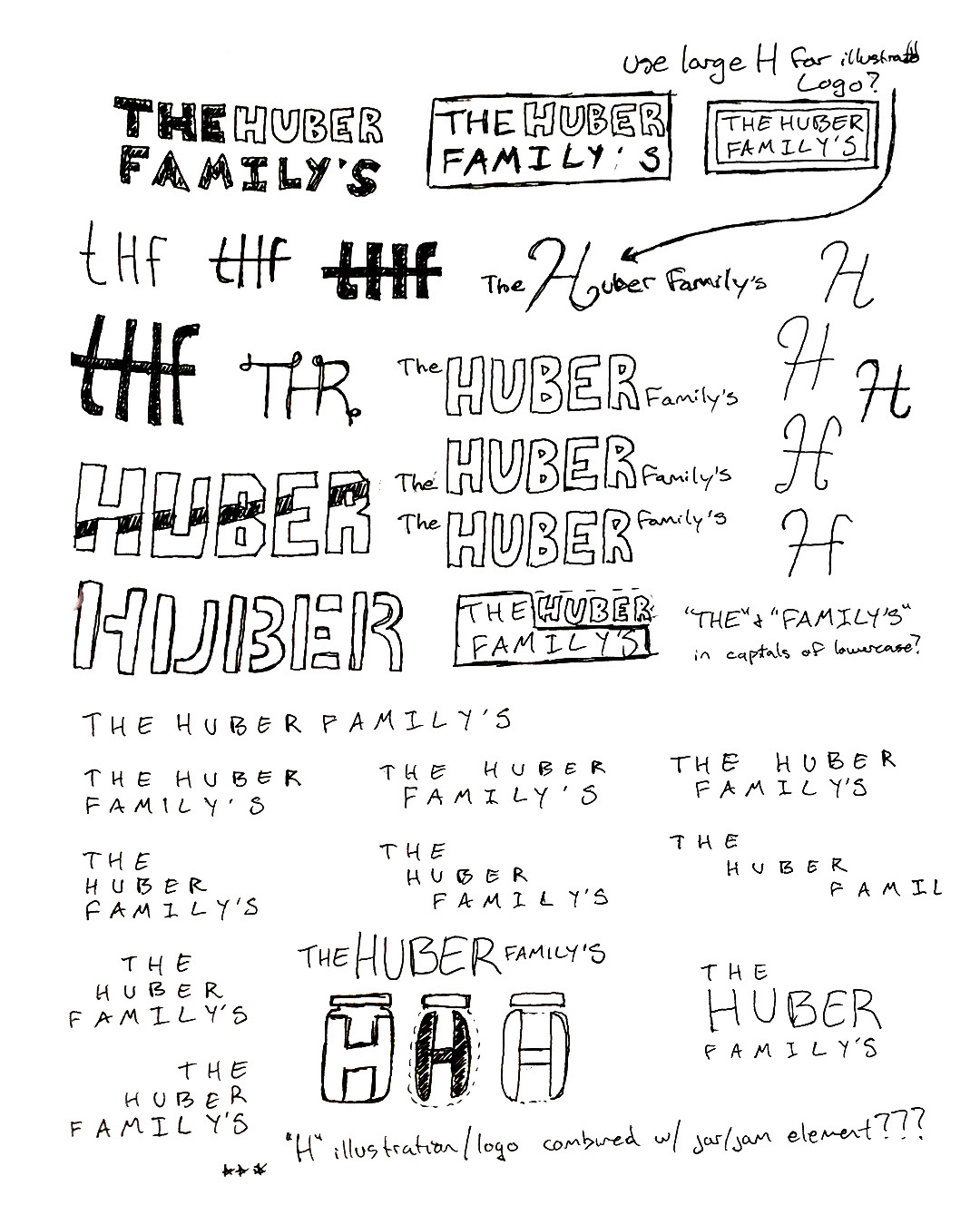


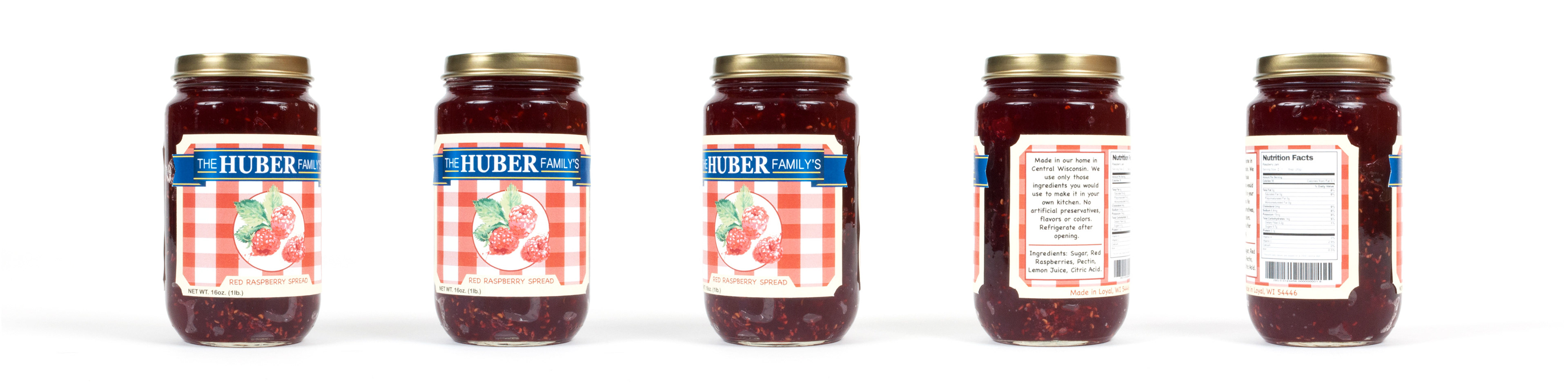
The original logo lacked personality and was too simple as just the set Hobo Std Medium red text. I wanted to create something that had a ribbon like appearance with a combination of typefaces to separate the Huber family name. I used a modified Georgia for the name “Huber,” and Microsoft Yi Baiti for the words “The” and “Family’s.” I set all the text in all capital characters so that it would be easily legible. The contrast of the white text on the dark blue really makes the lettering pop. I added the yellow lines to the ribbon to match the underline of the text, and to make the logo more complete.

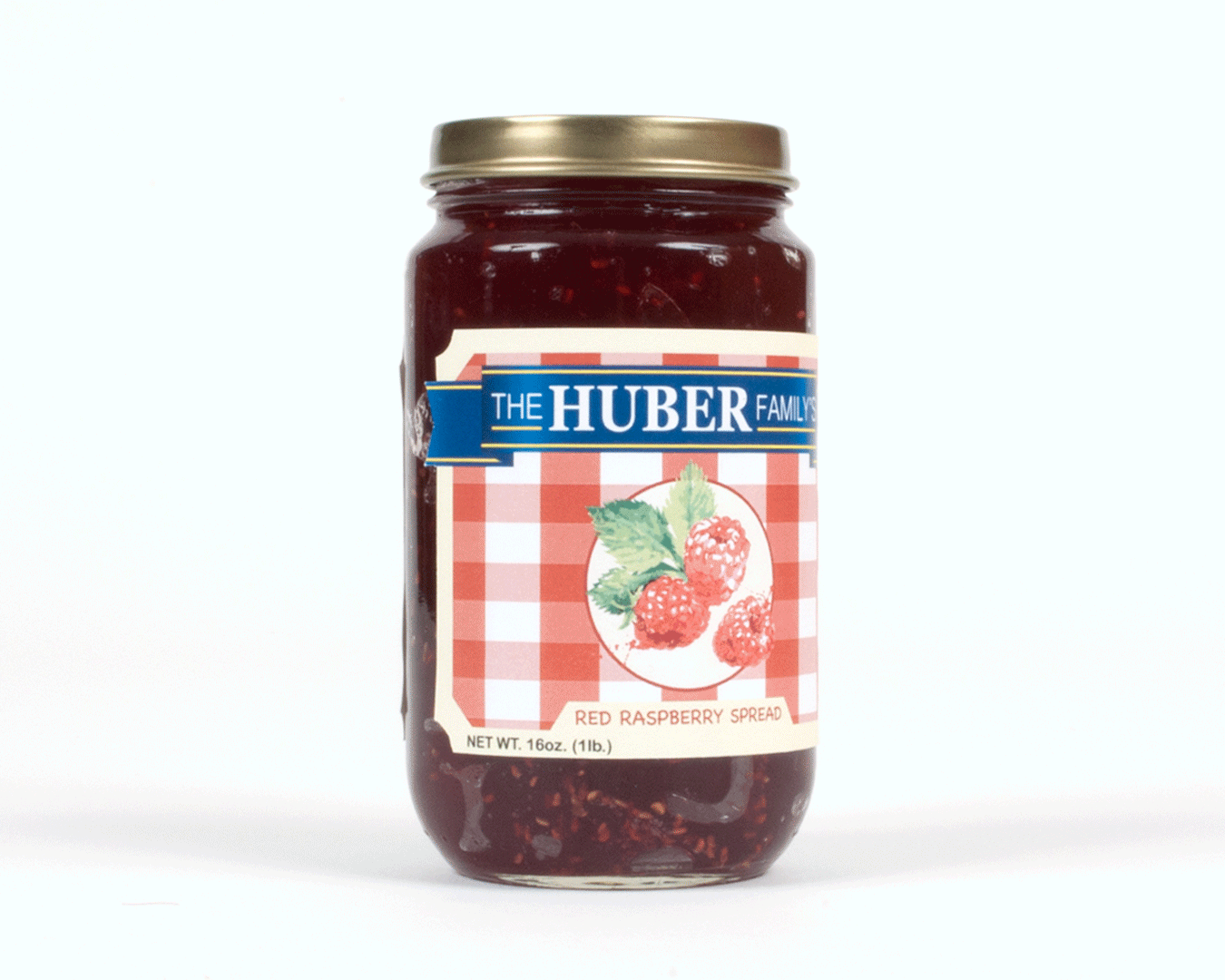
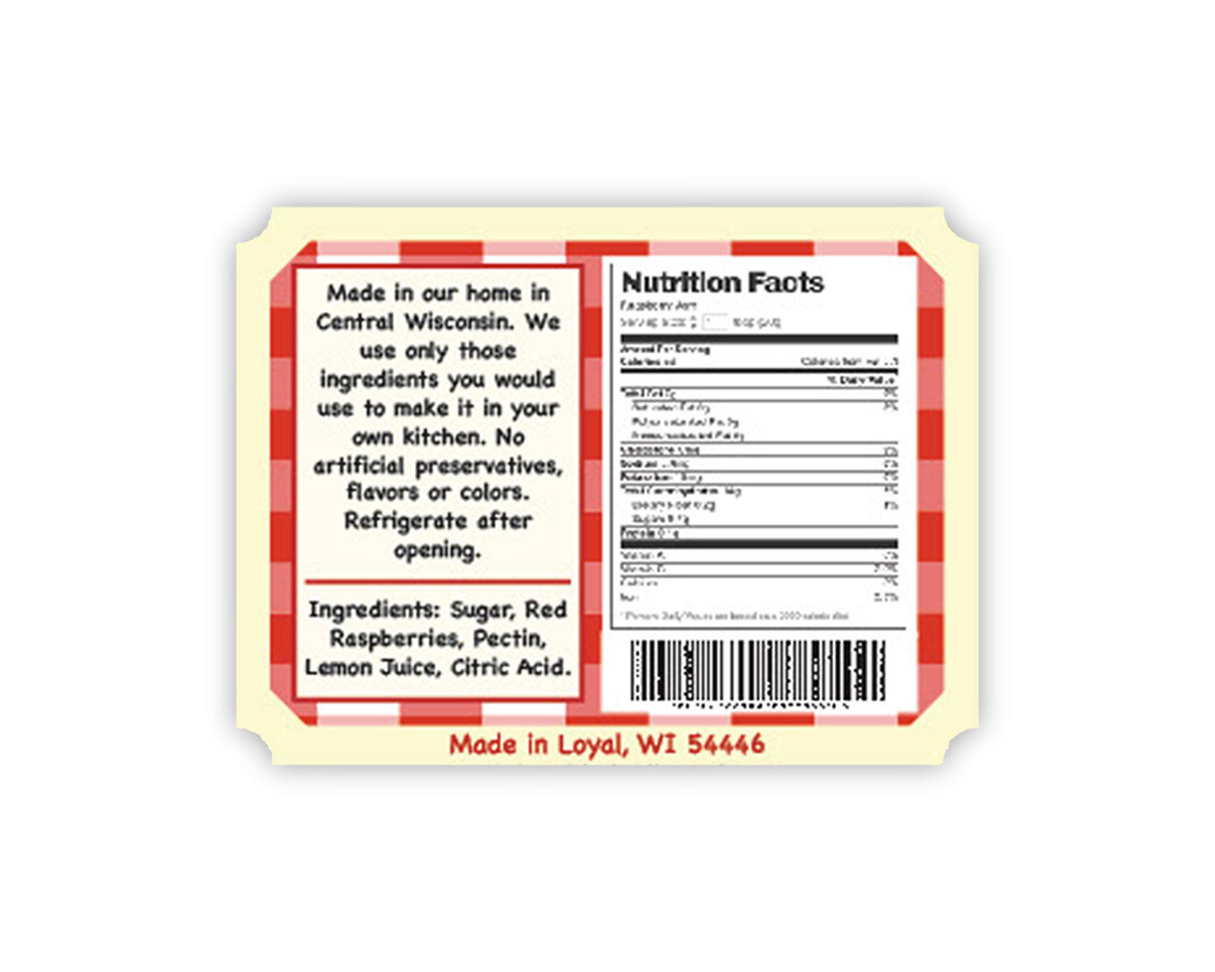
The whole overall appearance of the package design also lacked a personality. I really liked how the red text on the original jar matched the red jam, so I wanted to continue the use of red within the new label. I created a label that has a hand crafted feel. I used the pattern from picnic cloths with a modern spin as the background. A cream color used to create a border with inverted rounded dye cut corners to add to the hand crafted and traditional feel. I also included a watercolor like raspberry illustration to also add to the hand crafted style. The blue ribbon has the appearance that it is wrapped around the jar, and on the ends extends past the labels border to give the label a unique appearance and personality.
